U.S. Federal Budget Chart
Posted By thestatedtruth.com on December 19, 2010
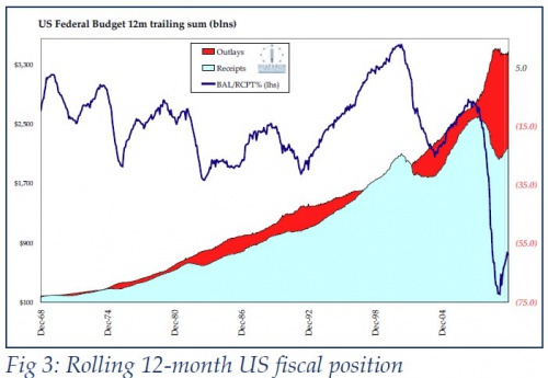
Well, the receipts (aqua color) aren’t looking so good, but the outlays (red color) are rolling to the upside. Just the opposite of what should be happening.
Â
Posted By thestatedtruth.com on December 19, 2010
Well, the receipts (aqua color) aren’t looking so good, but the outlays (red color) are rolling to the upside. Just the opposite of what should be happening.
Â
Categories: Commentary, Economy, National News, Wall Street, World News
Tags: U.S. Budget Chart
Coming Soon
bank owned banks congress consumer credit debt Economy education equity fund flow data food stamps foreclosures Free Money gdp gold Government Greece housing inflation Interest rates japan Middle East Money mutual fund outflows net worth new normal Oil pensions PIMCO politics Quote of the Day Real Estate Recession retirement Rich Rich man spending stock market Student Loans taxes tid bits unemployment Wall Street war Wealth Wealthy weather
Copyright © 2026 The Stated Truth

Comments